
MakeupTutorials is a free access website to watch and publish makeup tutorial videos with information about makeup products.
Project Duration: 2 weeks.
My role: Lead UX designer.
Responsibilities:
- User research
- Wireframing
- Prototyping (low-fidelity and high-fidelity)
Challenge
Makeup tutorial videos usually don’t have products information before watching the video. Not every makeup artist publishes the products they use, making it difficult for others to reproduce the makeup on themselves.
Solution
A website for the beauty community where you can easily access makeup tutorials and the products used in the tutorials.
User research
Empathy map
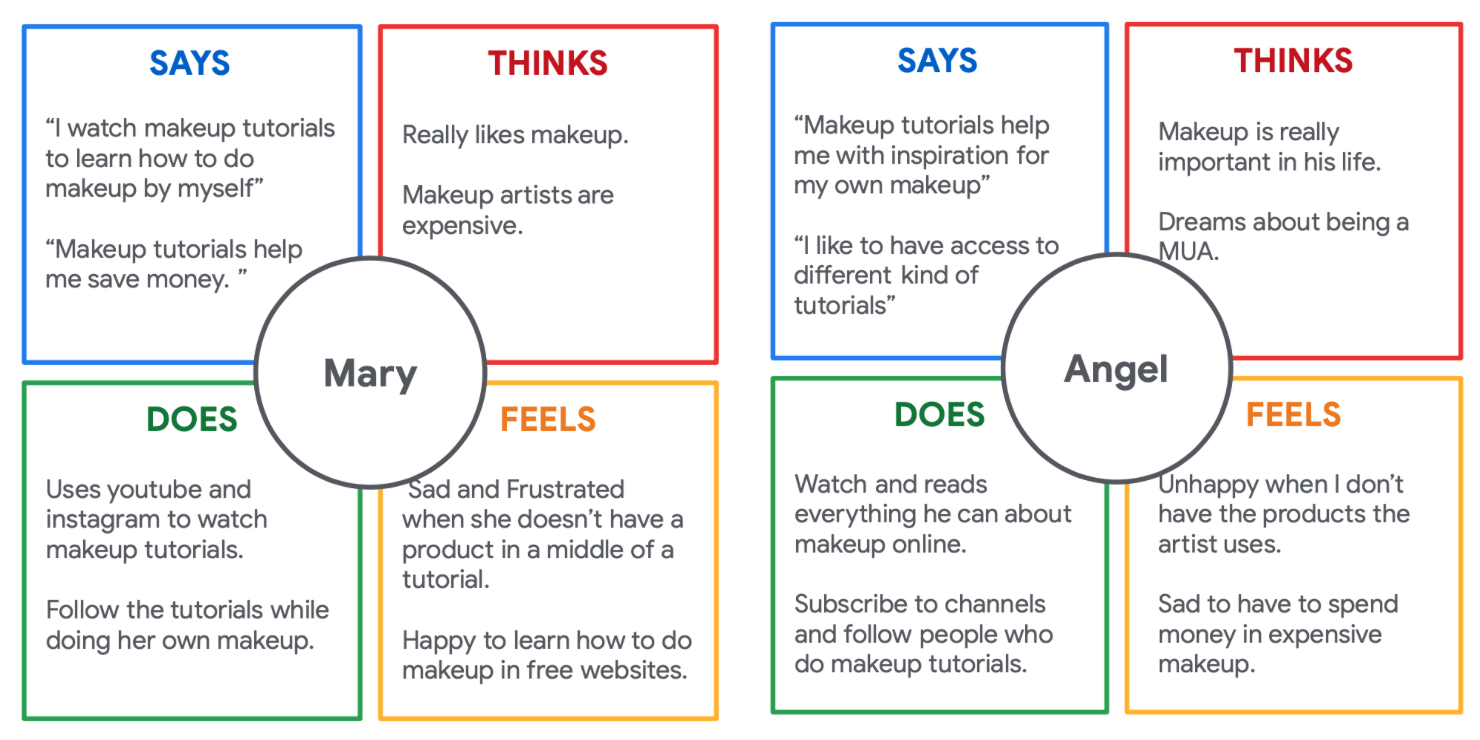
The research phase started by interviewing potential users. Based on this interviews I built two empathy maps.
Summary
In the first stage of the research, a primary user group was identified as people who watch makeup tutorials online to perform makeup on themselves.
The research gave some insights into the user concerns about having makeup products to use while watching a tutorial because many people do makeup on themselves simultaneously while watching tutorials. Also, a problem with high makeup artists prices and a lack of time to watch long tutorials were identified.
Pain points
- Products: users need the makeup products while reproducing the makeup on themselves;
- Money: sometimes makeup artists are too expensive;
- Time: some users don't have time to watch long makeup tutorial videos.
Persona
Problem statement: Mary is a full-time college student who wants to know the products she will need before watching a makeup tutorial because not having a product in the middle of a makeup keeps her from finishing it properly.

User journey map
As a full-time college student, Mary needs a website that lets her know the makeup products she needs for a makeup because she wants to follow up on makeup tutorials.

Design
Paper Wireframes
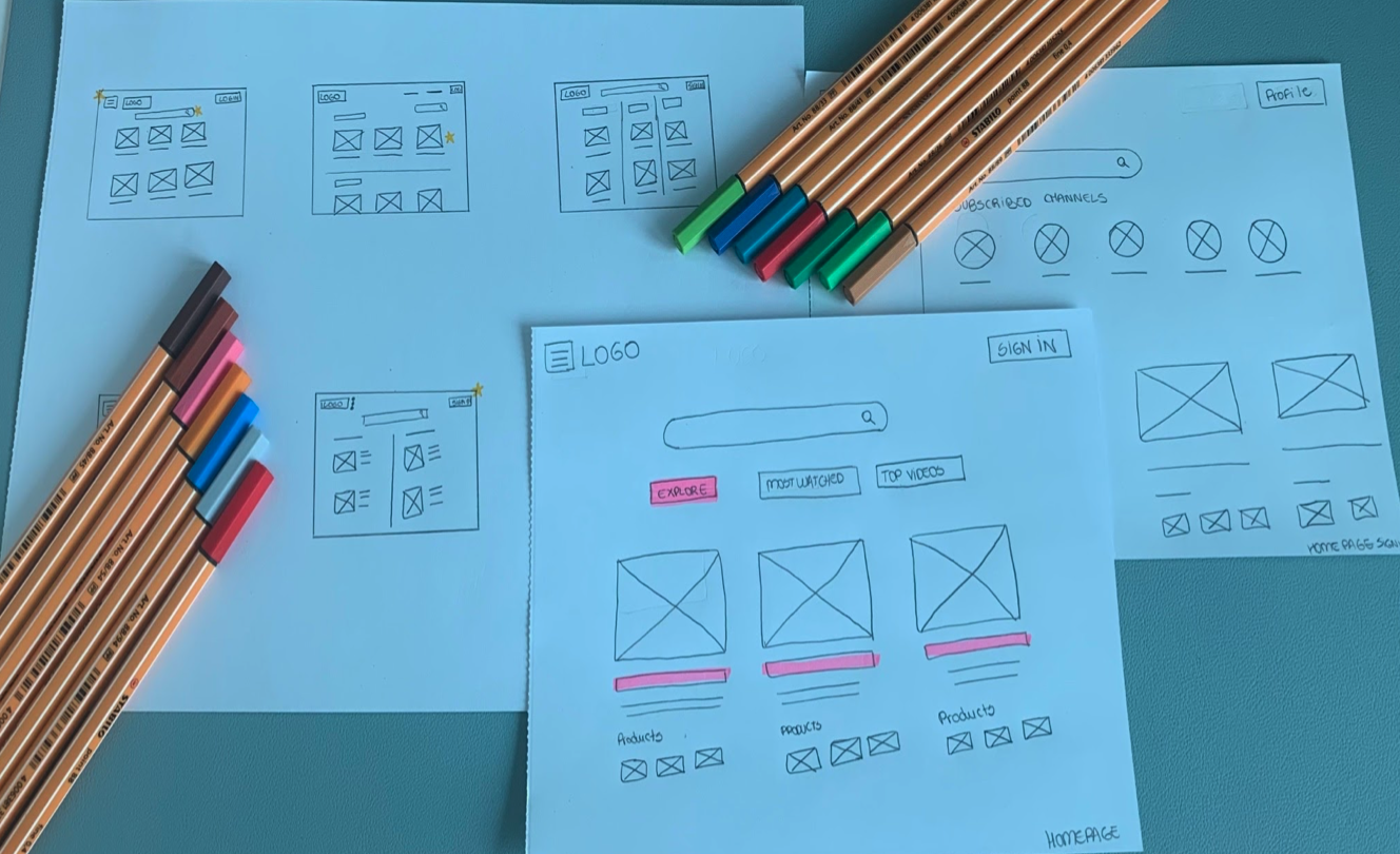
I drew five options for the homepage with the paper wireframes and selected the best features to apply in a final design to the wireframe. The priority was making an easy-to-navigate home screen for the user.
Digital Wireframes
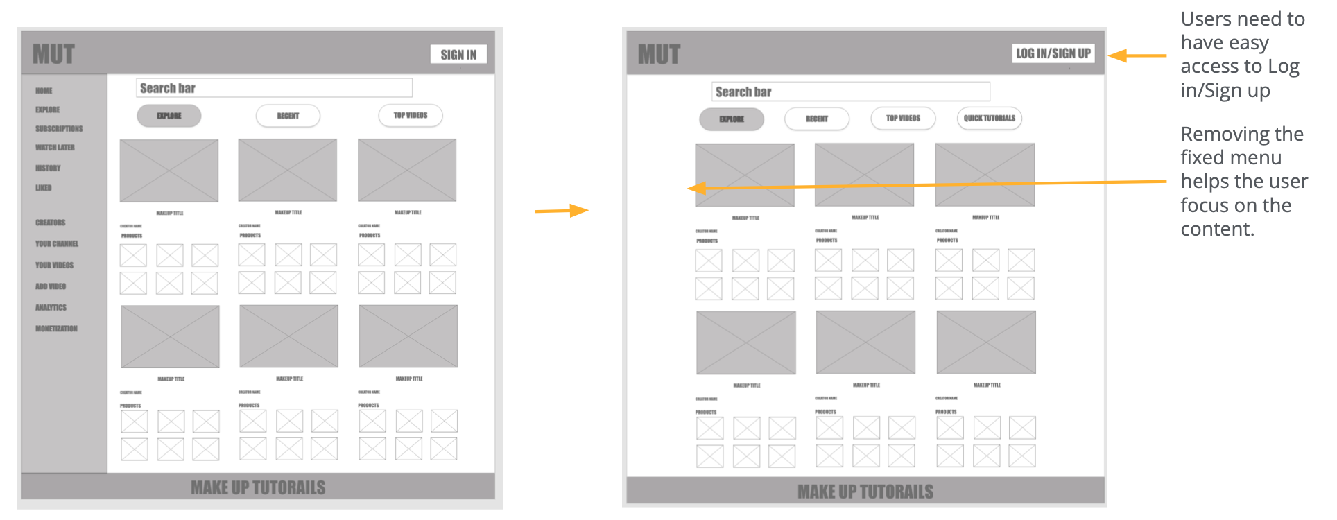
Based on the theme that: navigation is not clear to the user on the homepage, an insight is: there could be less information to be easier to navigate.
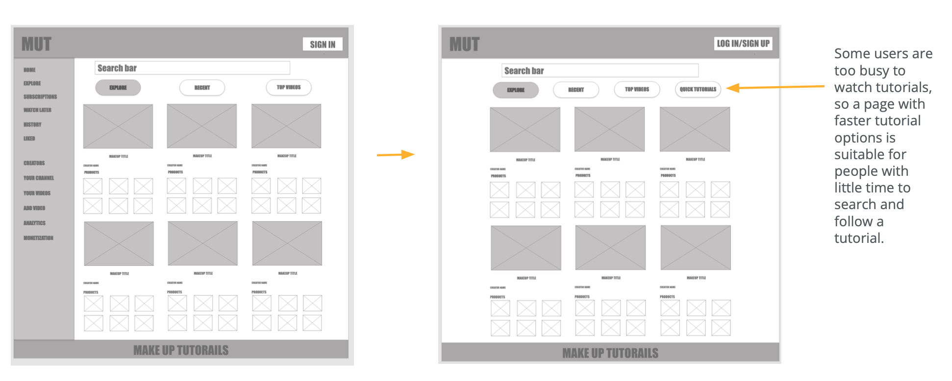
Based on the theme that: users need easy access to fast tutorials, an insight is: there could be a page for quick makeup tutorials options.
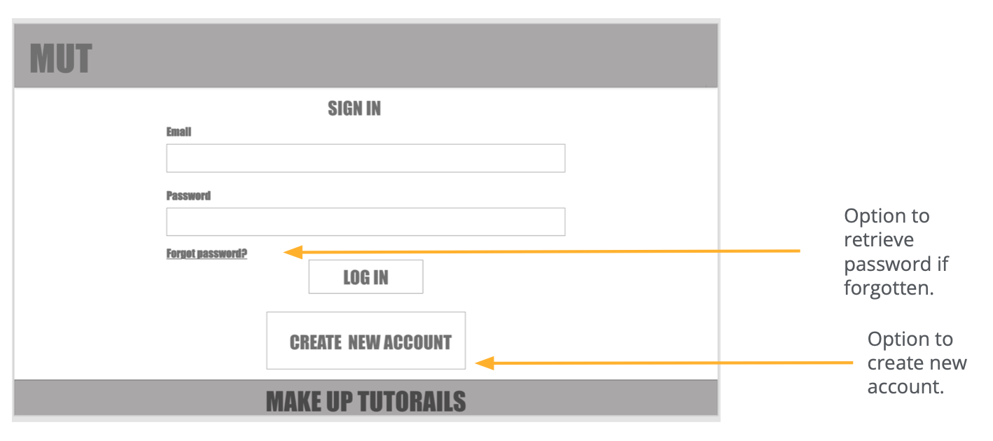
Based on the theme that: user flow was not clear, an insight is: add a Sign-in page to the user flow with essential elements that add value to the user experience.
Usability study
An Unmoderated usability study was conducted with the low-fidelity prototype to understand what users think of the app and find room to improve.
Findings
- The homepage was too crowded and not easy to navigate;
- The users need options to find fast tutorials due to lack of time;
- The users could use more steps in the user flow.
Mockups
The goal with the design was to make an easy-to-use and navigate website. I started with designs of the homepage.
I changed the option to see products icons for buttons so the homepage would have more negative space. Also, added a search button to the bar on top of the screen because it seems more intuitive to users to type and press a button.

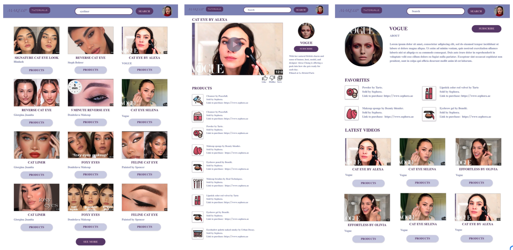
Then I did the other pages mockups using the same sticker sheet created for the homepage. I used colors to represent the different types of buttons.

Website high-fidelity prototype
High-fidelity prototype
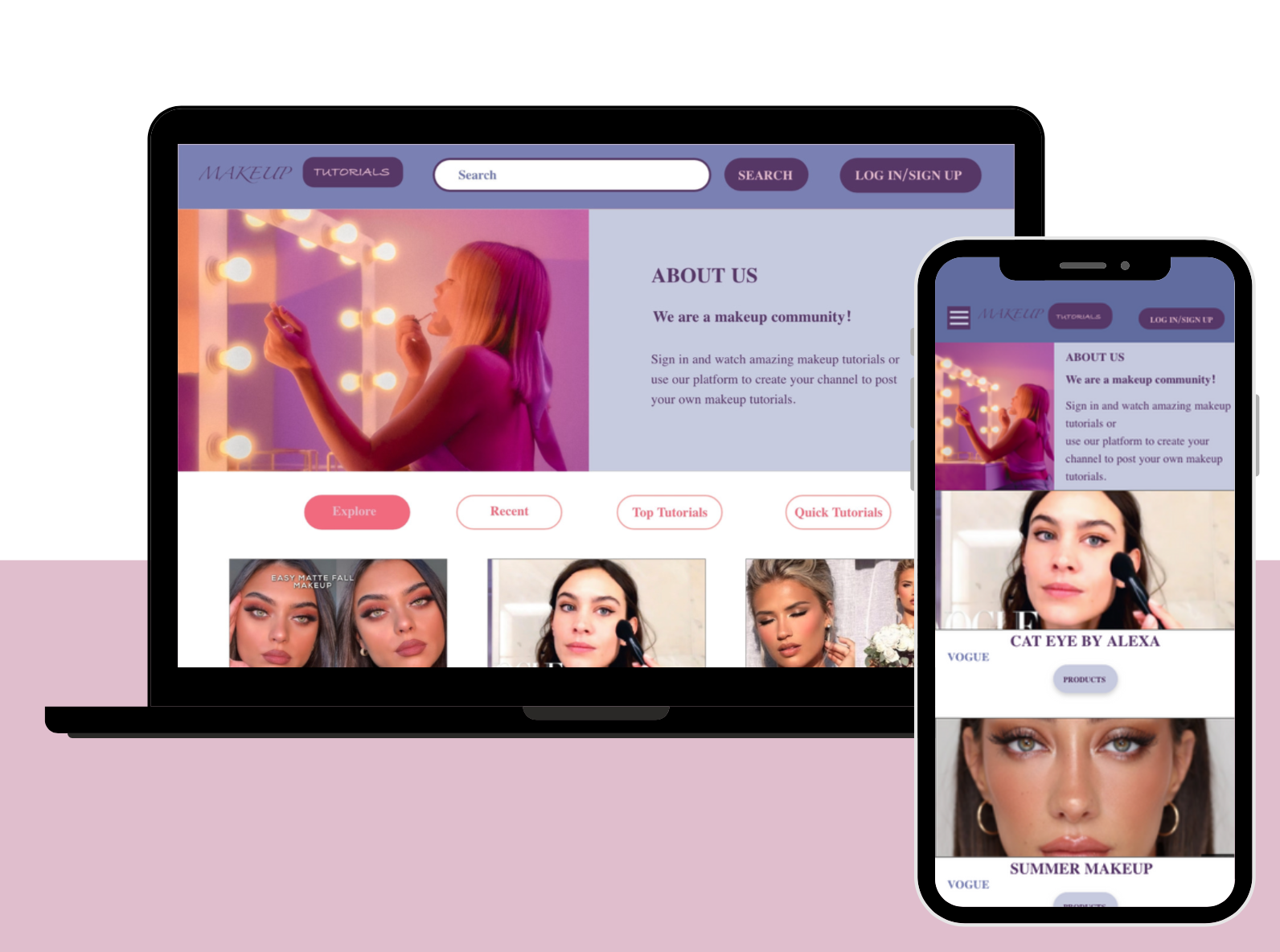
Responsive website
The website was designed for a desktop and mobile version to keep in mind the Next Billion Users.
Takeaways
Impact: The website creates a possibility for a beauty community interested in makeup tutorials.
What I learned
- How to create wireframes, low-fidelity prototypes and high-fidelity prototypes in Adobe XD;
Thank you for reading!